top of page

Marcardin Calligraphy
Rebranding and UI for Marcardin Calligraphy

Type of Work
UI / UX design
My Role
Lead designer
The Challenge
Take an existing website and make it more visually appealing, easier to use and more intuitive to the user.
Logo Design
For the logo, I incorporated her handwriting to make it an eye-catching, elegant graphic.
Branding
New stationary was created to reflect the clean, new image of the brand.

Web Redesign
More visually appealing with more interactivity and highlighting my clients beautiful work.

Before

After

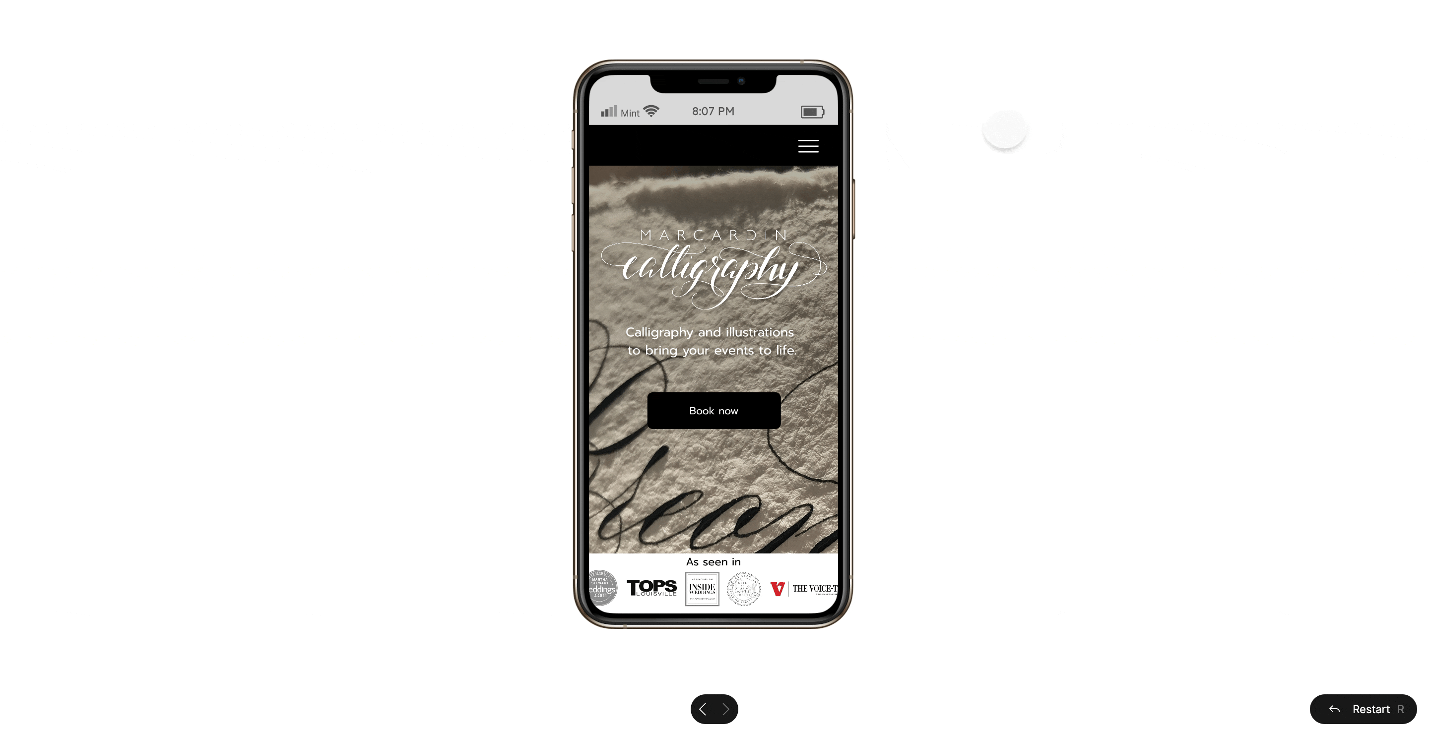
Prototype
Final Design
My goal for this project was to create something both easy to use, and visually stunning. I wanted to design something that was bold and stood out from the rest. Modern and classy, simple and clean. With minimal pages, intuitive navigation, her work is the star of the show, as it should be. She was very happy with the result, and said sales have gone up 34% since implementing the new design.
"You can't use up creativity. The more you use, the more you have."
— Maya Angelou
bottom of page